

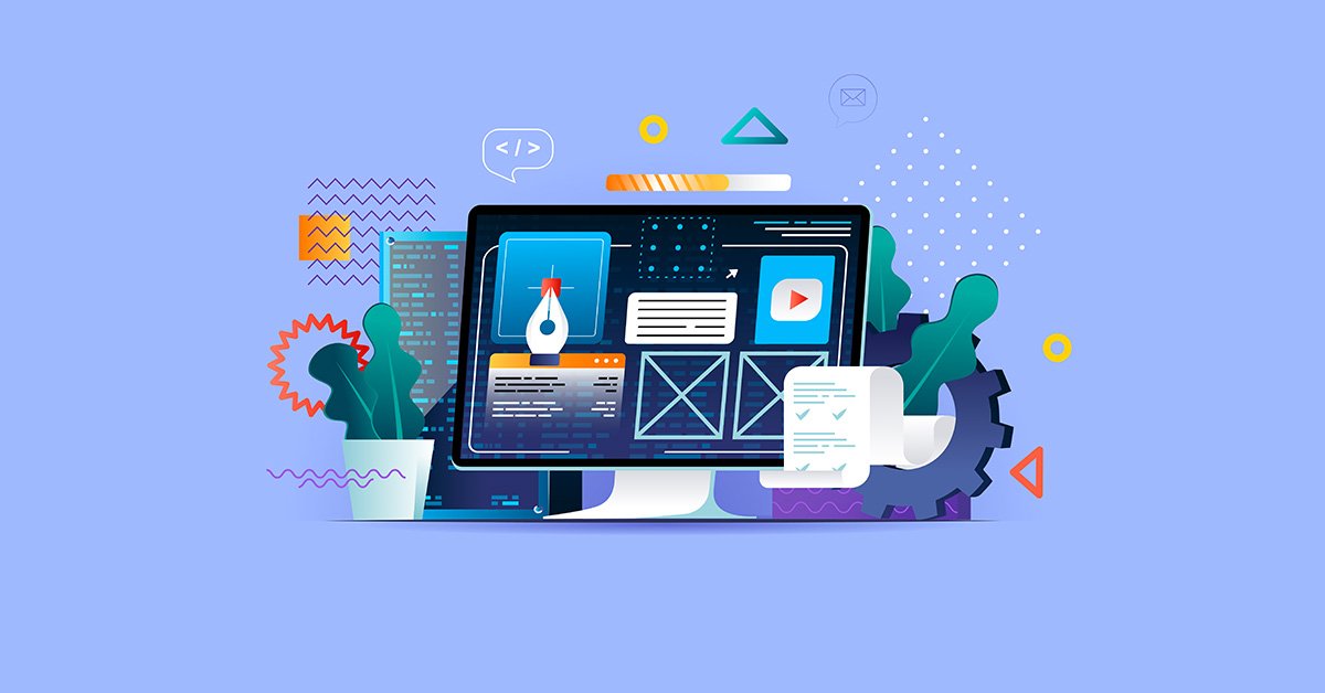
Building a website involves combining design, content, and functionality to create an engaging online presence. Whether it’s a personal blog, e-commerce site, or portfolio, understanding how websites are structured helps beginners plan and manage their projects effectively.
A well-structured website ensures better user experience, easier navigation, and improved SEO.
1. Website Structure Basics
A website is organized into several core components:
-
Header – Appears at the top of each page, usually including the logo, navigation menu, and key links.
-
Body – The main content area that contains text, images, videos, and other information.
-
Footer – Located at the bottom, typically containing contact info, links, disclaimers, and social media icons.
These components create a consistent layout across all pages, improving usability.
2. Web Development Technologies
Websites are built using a combination of frontend and backend technologies:
-
HTML (HyperText Markup Language) – Structures the content on webpages, such as headings, paragraphs, and links.
-
CSS (Cascading Style Sheets) – Controls the visual appearance, including colors, fonts, spacing, and layouts.
-
JavaScript – Adds interactivity, such as sliders, pop-ups, forms, and dynamic content.
-
Backend Languages – PHP, Python, or Node.js manage server-side operations, databases, and user interactions.
Frontend technologies handle what users see, while backend technologies handle what happens behind the scenes.
3. Content Organization
Good website structure makes content easy to find and navigate. Key elements include:
-
Pages and Sections – Home, About, Services, Blog, Contact
-
Categories and Subcategories – Especially important for blogs or e-commerce sites
-
Navigation Menus – Top or side menus that guide users
-
Internal Linking – Connects related content to improve SEO and user flow
Organized content ensures visitors can quickly access information and improves search engine rankings.
4. Responsive Design
A modern website must work on all devices:
-
Responsive design adapts the layout to desktops, tablets, and smartphones.
-
Flexible grids, media queries, and scalable images ensure usability on any screen size.
Responsive websites provide a consistent user experience and are favored by search engines.
5. Website Functionality
Beyond content and design, websites often include functional elements:
-
Contact forms or registration forms
-
E-commerce shopping carts and payment gateways
-
Search functionality
-
Interactive media such as videos or galleries
These features enhance engagement and user interaction, making the website more useful.
6. Testing and Optimization
Before launching a website, it’s important to:
-
Test cross-browser compatibility
-
Check loading speed and performance
-
Optimize images, scripts, and CSS
-
Ensure SEO best practices are applied
Testing ensures the website is fast, functional, and user-friendly from day one.
Final Thoughts
Understanding how HTML, CSS, JavaScript, backend systems, and content organization work together allows beginners to create effective, user-friendly, and SEO-optimized websites.
A well-planned website structure ensures visitors can navigate easily, find information quickly, and enjoy a seamless browsing experience, which is critical for online success.